Last updated: November 2026
If you’re wondering what to remove from a landing page, start with whatever stands between the searcher and the answer. When a page is struggling, the fix I reach for first is subtraction. I remove the long warm-up intro, the second “why choose us” block, FAQs nobody asked, the hero slider, numbers that went stale years ago, stock photos and copy that could sit on any site, and the extra buttons fighting the main one. What stays should answer the searcher’s question and help them act. Nothing else earns its place.
That’s the short version. The longer one comes with a warning, because cutting the wrong thing hurts more than leaving clutter alone.
Why removing content can help a landing page
A landing page has one job. Someone searched for something specific, and the page should show them, fast, that they’re in the right place and what to do next.
Clutter gets in the way of that in two ways. People skim past the useful part, or never reach it. And search systems, including the ones writing AI answers, have a harder time working out what the page is actually about. When I read a page and can’t tell in ten seconds what it sells and to whom, I assume a machine has the same problem.
There’s a third, quieter cost. Every extra section is something to keep up to date. Most teams don’t. So the clutter goes stale, and stale content on a money page is a trust problem.
One thing I want to be clear about, though. Google’s own guidance on core updates warns against “quick fix” changes, like removing a page element because you heard it was bad for SEO, and calls deleting content a last resort. I agree with that. I don’t cut things because of a rule. I cut them because they don’t help the person reading.
My landing page cut list
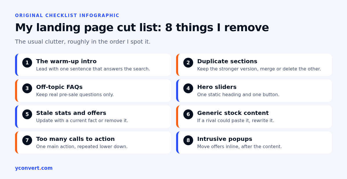
These are the things I remove most often, roughly in the order I spot them.
1. The warm-up intro
“Welcome to our website. Founded with a passion for excellence…” Nobody searched for that.
Say a dental clinic has a page for emergency tooth pain. The person landing there is in pain and wants to know two things: can I be seen today, and how do I book? If the first screen is three paragraphs about the clinic’s philosophy, they’re gone. I replace the warm-up with one direct sentence that answers the search, then the booking route. I’ve written more on how to do that in my guide to the answer-first paragraph.
2. Duplicate sections
Pages that grew over time collect repeats. Two benefit lists that say the same thing in different words. A services grid at the top and a services list at the bottom. A second intro halfway down that restates the first.
I pick the stronger version and delete the other. If each has one good line, I merge them.
3. FAQs that don’t belong
FAQ sections attract filler. “Why should I choose you?” “Are you the best?” Questions about services the page doesn’t sell. Or questions already answered word for word in the body above.
A law firm’s page for tenancy disputes doesn’t need a question about wills. Keep the questions real people ask before they enquire, answer them properly, and cut the rest. My take on whether the markup is still worth adding is in does FAQ schema still help.
4. Hero sliders and carousels
Rotating banners look busy and say very little. Most visitors see the first slide only, and the rest often carry the messages that mattered. They can also slow the page and push the real heading down.
I replace a slider with one static hero: a clear heading, one line of support and one button. If there were five messages, four of them were probably for the business, not the visitor.
5. Stale stats, dates and offers
“Serving clients since…” with a count that hasn’t been updated. A “this season” offer from two seasons ago. Awards with no year, or with a year that now looks old. A “new” feature that launched ages back.
Take a hotel’s landing page for weekend breaks. If it still promotes a package that ended, or mentions a pool that’s closed for renovation, the page is making promises the front desk can’t keep. Either update the fact with a real, current one, or remove it. Never bump a number just to look fresh.
6. Generic stock content
Stock photos of handshakes. Smiling people at laptops. Paragraphs like “we are committed to quality and customer satisfaction” that would fit a florist, a bakery or a bank.
A quick test I use: could a competitor paste this paragraph onto their page without changing a word? If yes, it’s not helping you. Swap it for something only you can say. A plumber can show a photo of a real job, name the areas they actually cover and say what a call-out includes. That beats any stock image.
7. Too many calls to action
“Book now”, “Get a quote”, “Download our brochure”, “Join the newsletter”, “Chat with us”, “Follow us”. All on the first screen.
When everything is a button, nothing is. A SaaS pricing page is where I see this most. Three plans, each with two buttons, plus a demo banner, plus a chat bubble, plus a popup offering a discount. I keep one primary action per page, repeat it lower down, and give the secondary path a quiet text link at most.
8. Popups that cover the content
A full-screen newsletter box the second the page loads is the online version of someone blocking the shop door. Google has long-standing guidance against intrusive interstitials that hide the main content, especially on mobile. If the offer is worth it, put it inline, after the visitor has seen what they came for.
What each cut buys you
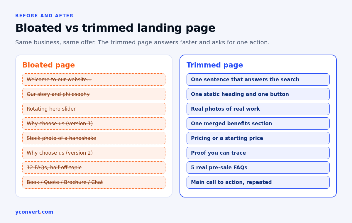
| What I remove | Why it hurts | What I put instead |
|---|---|---|
| Warm-up intro | Delays the answer the searcher came for | One sentence that answers the search |
| Duplicate sections | Repeats the same point, pushes key content down | The stronger version, merged if needed |
| Off-topic FAQs | Dilutes what the page is about | Three to five real pre-sale questions |
| Hero slider | Hides messages, slows the first screen | One static heading and one button |
| Stale stats and offers | Promises the business can’t keep | A current, checkable fact, or nothing |
| Stock photos and generic copy | Says nothing specific about you | Real work, real areas, real details |
| Extra buttons | Splits attention between competing actions | One main action, repeated lower down |
| Intrusive popups | Blocks the content people searched for | An inline offer after the main content |
What I never remove
This is where pruning goes wrong. People get into a tidying mood and start deleting things that were doing real work.
- Pricing or a price range. Even a starting point. Hiding it to make the page shorter is a false economy.
- Proof. Real case examples, reviews you can trace, photos of actual work.
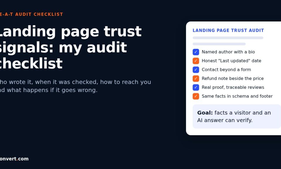
- Contact details and the refund or cancellation line. These are trust signals, and they’re short already. I’ve covered them in my landing page trust signals audit checklist.
- Content that already gets search impressions. Before cutting a section, I check which queries the page shows up for. Sometimes the paragraph that looks like filler is the one ranking for a useful long-tail search. Then I rewrite it, I don’t delete it.
- Answers to real objections. A driving school page that explains what happens if you fail the test isn’t padding. That’s the question stopping people from booking.
How I decide: keep, rewrite, merge or cut
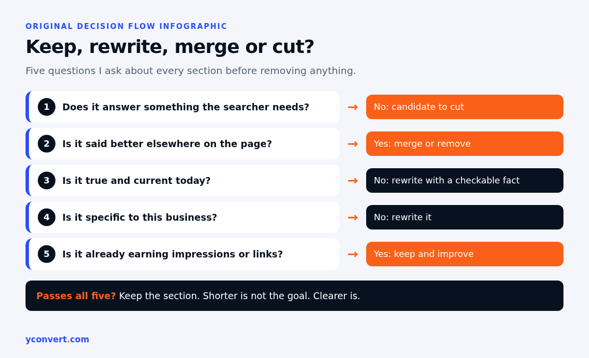
I go through the page one section at a time and give each a verdict. It takes longer than skimming and deleting, but it’s how you avoid losing something useful.
- Does this section answer something the searcher needs? If no, it’s a candidate to cut.
- Is it said better somewhere else on the page? If yes, merge it into that section or remove it.
- Is it true and current today? If no, rewrite it with a fact you can check, or cut it.
- Is it specific to this business? If a competitor could use it unchanged, rewrite it.
- Is the section already earning impressions or links? If yes, keep it and improve it rather than delete.
Anything that survives all five stays. Most pages I work on end up noticeably shorter, though I never aim for a word count. Shorter isn’t the goal. Clearer is.
Picture an interior designer’s page going through this. It would probably lose its slider, a vague “our story” block and half its FAQs, and gain one paragraph on how a first consultation works. Fewer words. More answers.
Mistakes I see when people prune
Cutting everything below the fold. Some visitors scroll because they need detail before they commit. Long isn’t bad. Padded is.
Deleting whole pages instead of sections. That’s a bigger decision, with redirects and links to think about. On a single landing page, I trim sections first.
Removing content, then changing the date. If the facts didn’t change, the updated date shouldn’t either.
Not checking afterwards. Make one round of cuts, then watch how the page does for a few weeks before the next round. If you change ten things at once, you won’t know which one mattered.
For everything beyond pruning, like intent, headings, schema and internal links, I follow my full landing page SEO audit checklist. Pruning is one step in it, and the one I enjoy most.
Find out what to cut on your page
If you’d like a list instead of a hunch, our AI SEO and AEO audit tool checks one landing page against one keyword and includes a remove and reduce list showing sections that don’t serve that keyword. Your first report is free with 1 credit. After that it’s $2 per report, or 10 reports for $15 and 20 for $20.
FAQ
Can removing content from a landing page improve rankings?
It can, when the content you remove was getting in the way: off-topic sections, repeats or filler that hide the main answer. Google’s guidance warns against quick-fix deletions, so remove things because they don’t help the reader, not because of a rule.
What should I remove from a landing page first?
Start with the warm-up intro, duplicate sections and FAQs that don’t match what the page sells. These are usually the quickest wins and the safest cuts.
Should I remove the FAQ section from my landing page?
Not by default. Keep the questions people ask before they buy or book and answer them properly. Remove only the filler questions and anything unrelated to the page.
Are image sliders bad for SEO?
A slider isn’t a penalty in itself, but it often hides important messages, slows the first screen and pushes the real heading down. One static hero with a clear heading and one button usually works better.
How do I know if a section is safe to delete?
Check if it answers a real question, if it says something not covered elsewhere on the page, and which search queries the page already appears for. If a section is earning impressions, rewrite it instead of deleting it.